import io.data2viz.charts.*
import io.data2viz.charts.core.*
import io.data2viz.charts.dimension.*
import io.data2viz.charts.chart.*
import io.data2viz.charts.chart.mark.*
import io.data2viz.charts.viz.*
import io.data2viz.charts.layout.*
import io.data2viz.math.*
import io.data2viz.color.*
import io.data2viz.geom.*
import io.data2viz.shape.Symbols
import io.data2viz.dsv.Dsv
import org.w3c.fetch.Response
import kotlinx.browser.window
import kotlin.js.Promise
import kotlinx.datetime.Instant
val width = 800.0
val height = 500.0
// The dataset holds : Auckland, Mumbai, Beijing, Chicago and San Diego
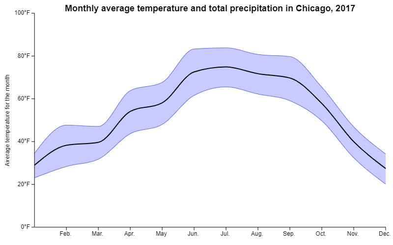
private val city = "Beijing"
// The dataset holds 2016 & 2017
private val year = 2017
// The "Weather" class
data class Weather(
val city: String,
val year: Int,
val month: Int,
val highTemp: Double,
val avgTemp: Double,
val lowTemp: Double,
val precip: Double)
// This function transform a CSV line to a "Weather" instance
private fun parseWeather(row: List<String>) = Weather(
row[0],
row[1].toInt(),
row[2].toInt(),
row[3].toDouble(),
row[4].toDouble(),
row[5].toDouble(),
row[6].toDouble()
)
// Just use a simple list of months label for the X axis
private val months = listOf("Jan.", "Feb.", "Mar.", "Apr.", "May", "Jun.", "Jul.", "Aug.", "Sep.", "Oct.", "Nov.", "Dec.")
fun main() {
// Creating and sizing the VizContainer
val vc = newVizContainer().apply {
size = Size(width, height)
}
// source file: https://docs.google.com/spreadsheets/d/1Rwa_frxeBqPad4bqxfm8sTxL8FRDSFODnreSWBhXvwg/edit?usp=sharing
// original taken from https://vincentarelbundock.github.io/Rdatasets/
val request: Promise<Response> =
window.fetch("https://docs.google.com/spreadsheets/d/e/2PACX-1vTX4QuCNyDvUoAwk6Jl6UJ4r336A87VIKQ5BVyEgowXG_raXdFBMvmUhmz1LLc07GavyC9J6pZ4YHqJ/pub?gid=650761999&single=true&output=csv")
request.then {
it.text().then {
// Parse all result, keep only one city and one year
val results = Dsv()
.parseRows(it)
.drop(1)
.map { parseWeather(it) }
.filter { it.city == city }
.filter { it.year == year }
vc.chart(results) {
title = "Monthly average temperature in $city, $year"
config {
cursor {
show = true
type = CursorType.Vertical
}
}
// The month is a discrete dimension
val monthDim = discrete( { domain.month } ) {
formatter = { "${months[this - 1]} "}
}
// This dimension is used to display the temperature
val tempDim = quantitative( { domain.highTemp } ) {
name = "Average temperature for the month"
formatter = { "$this°F" }
}
// This dimension is also used to display a temperature
// We want to share axes and dimension properties for the 2
// So, this dimension is declared as a "child dimension" of the previous
val avgDim = tempDim.child( { domain.avgTemp } )
// First display the precipitation using a BarMark
area(monthDim, tempDim) {
curve = MarkCurves.Curved
// The "baseline" of the area chart, default to .0, here we use the "min temperature"
baseline = { domain.lowTemp }
y {
min = .0
start = .0
end = 100.0
}
}
// Then display the mean temperature using a LineMark
line(monthDim, avgDim) {
curve = MarkCurves.Curved
strokeColor = constant(Colors.Web.black)
strokeColorHighlight = constant(Colors.Web.black)
strokeWidth = constant(2.0)
}
}
}
}
}